Zippex Design Language
Delivery, designed to feel effortless. The living system behind every Zippex surface.
Introduction
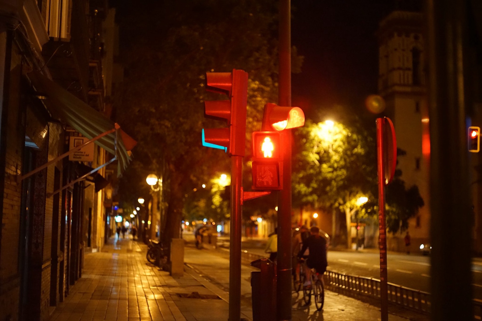

Zippex is a delivery network for real neighborhoods: store to store, door to door, moving at street level. The identity is calm and exact — deep navy for confidence, orange for motion, teal for the live moment. Surfaces stay light and quiet so the delivery, not the interface, is the event.
This page is the system of record. Every asset on it is the production asset: copy it, download it, or export the whole kit from the sidebar.
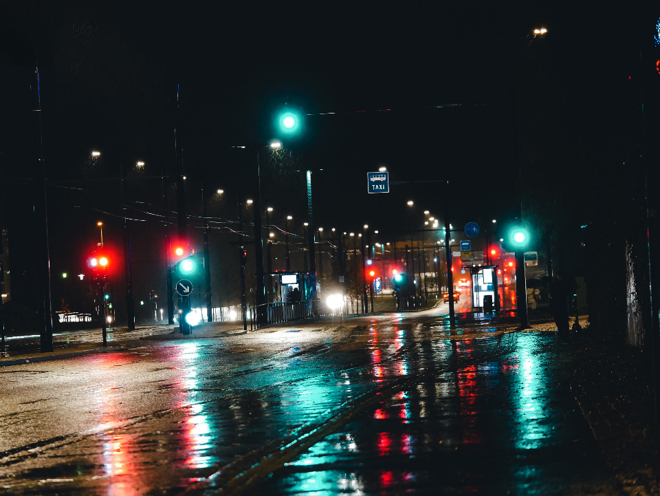
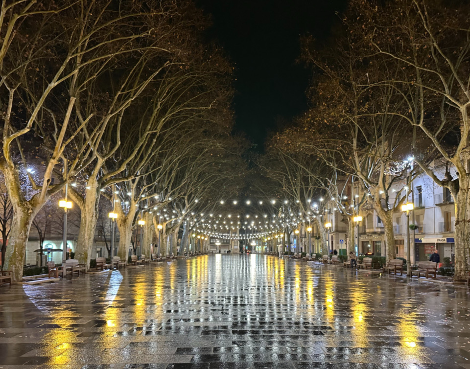
Photography stays at street level and in the brand’s hours: dusk and night, sodium-orange light, navy shadows, teal signals. No drone skylines, no midday sun, and never a color filter faking the palette — find streets where it already lives. Set the wordmark on photography only over a navy scrim. All bundled imagery is CC0.
When there is no photograph, there is silk: the generative navy texture behind hero moments — onboarding, searching for a courier, empty states. It renders live, pauses off-screen, and falls back to a still under reduced motion.
Marks


The X carries the whole silhouette, so it stays legible small. Below 22 px, drop the full-color version and use a flat colorway; below 16 px, prefer the mark alone over any lockup.
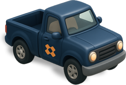
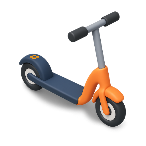
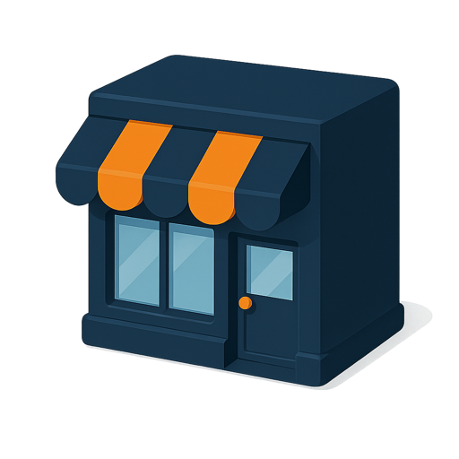
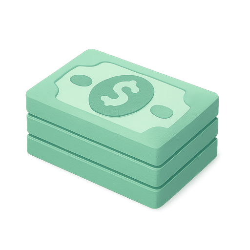
Brand items are rendered props, not icons: they appear in empty states, onboarding, and marketing moments. Use them at rest on quiet surfaces — never as UI glyphs.
Color
Five colors, no gradients in UI. Navy is structure and text, orange is motion and primary action, teal is the live moment.
The semantic set maps meaning — not hue — so status reads the same in every app. Warn reuses brand orange; info reuses teal.
Light surfaces dominate. Navy takes structure and one dark moment per screen; orange and teal are functional accents. The palette loses its calm if every surface shouts.
Use high-contrast pairings for text and controls. Orange and teal fail on light surfaces at text sizes — reserve them for icons, fills, and large numerals on navy, and never for functional copy.
Typography
Weight does the hierarchy work: SemiBold for headings and buttons, Regular for everything that reads. Bold is reserved for display moments — never for emphasis inside body copy.
Layouts use a modular scale so hierarchy stays consistent from chat UI to posters. Zippex ships 15 px on a major third — enough contrast between levels to feel expressive without display sizes overwhelming small screens. Adjust for the surface, then copy the result as CSS custom properties. Shipped apps still run Montserrat until they migrate.
Motion
Four durations, nothing over 400 ms, and everything UI-facing under 300. Timing is felt, not read: press feedback lands at 140 ms so the interface answers the finger.
Custom curves everywhere — the built-in CSS easings are too weak to feel deliberate. Never ease-in on UI, never scale from zero, springs for gestures and anything interruptible. Reduced motion is a first-class path: loops freeze to a meaningful still, never a blank.
Components
Press is slow and deliberate · release snaps back instantly
Everything here is live — press it. The full set with every state, plus layout patterns and native parity notes, lives in the pillar pages.
Applications

One language, four dialects. Each app keeps its bespoke moments — the driver’s going-online ring, the merchant’s till — in its own quirks page, but every curve, color, and duration pulls from the shared system. If a quirk earns a second app, it graduates into the signature set.
Voice
Buttons are verbs. Errors name the problem and the fix in one calm line. Empty states reassure, then point forward. No exclamation marks doing the interface’s job, and nothing shouts — the voice is a courier who knows the route.